

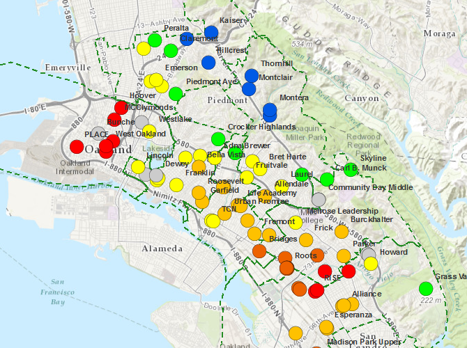
Oakland Unified School District has released its new maps detailing the amount of stress at each of the school sites. Red dots signify those in neighborhoods with increased stress, violence and poverty, while green and blue dots are the schools which it considers the least stressed. While living within the boundaries of a particular school zone give you a priority to attend that school, it certainly isn’t fixed; a fascinating set of heat maps is now available that show where the students at any particular school live.
While interesting in their own right, these maps will be the basis of major funding shifts as the new Local Control Funding Formula is implemented. According to a report by KQED, red dot schools received $95k in additional funding last year. As the Governor’s new funding methods increase, expect to see much more funding moving to the schools that need it the most. If done well, we might see future maps with much more green.